Squarespace is great. You can choose from several very good looking templates for building your website. Most of them support large banner images that works across desktop, laptop and mobile phones. Two of the most popular templates are the Bedford template, and the Harris template.
Because these templates are responsive, you need to be careful when creating any banner image, especially if there are specific part of the image that you do not want to be cropped by the responsive layout. For example, if you show a headshot of a person, you want to carefully control which part of the face is always visible.
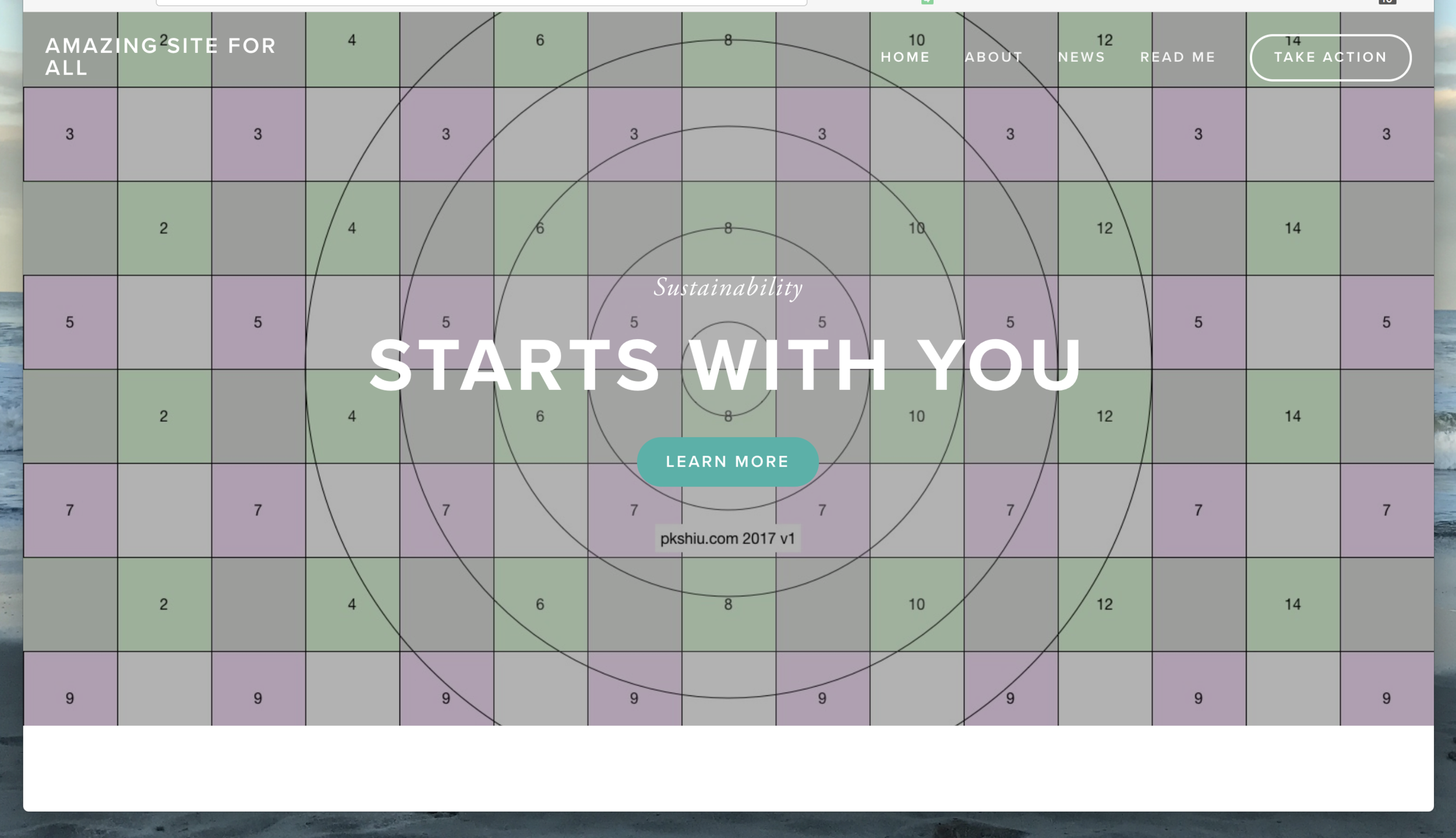
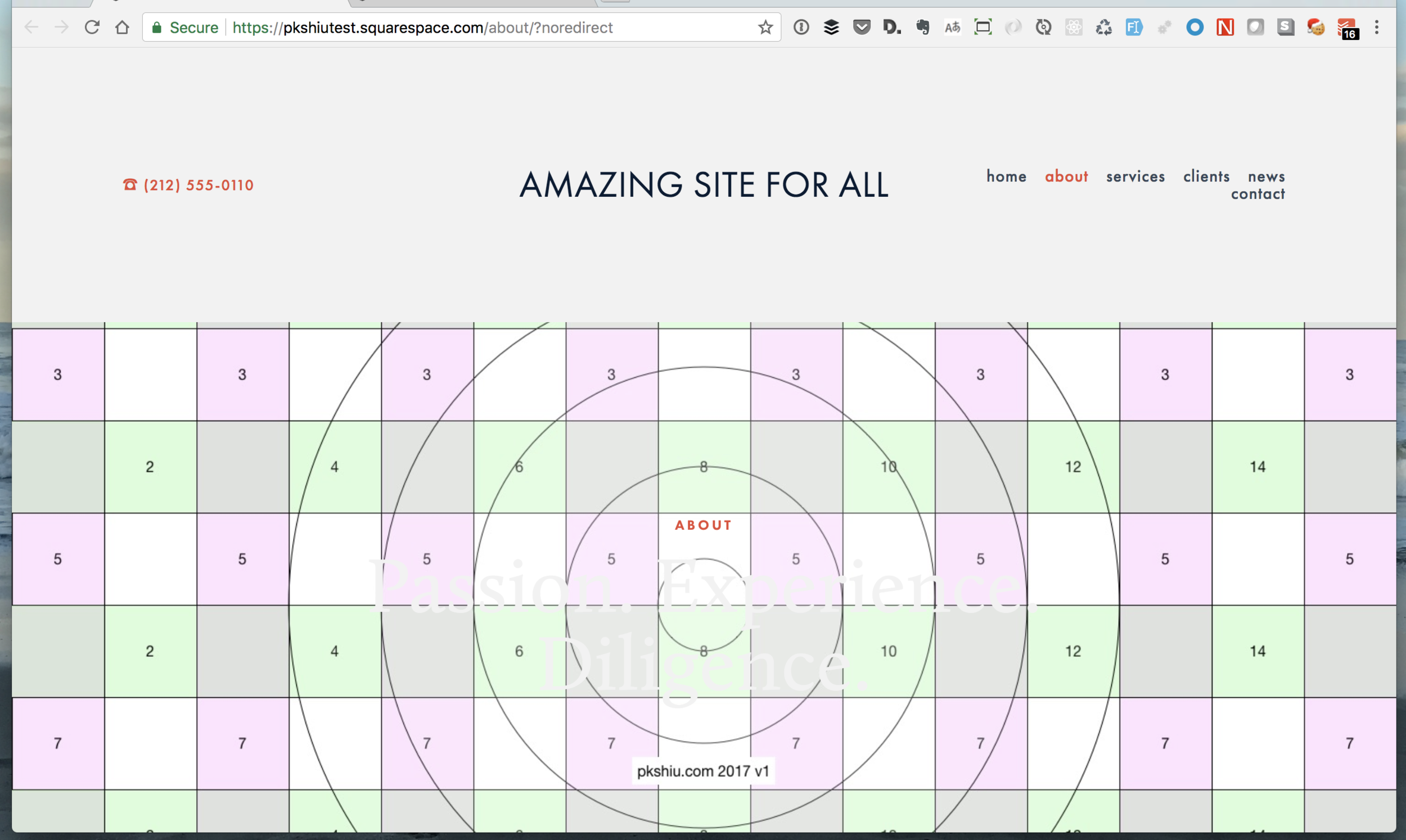
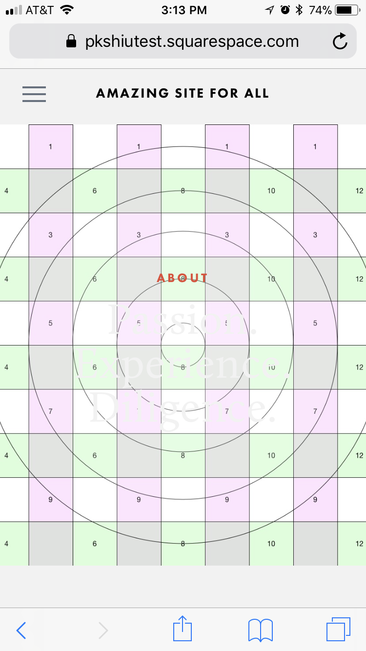
To help you (and I) understand the responsive template works, I have created this test image. If you use this image when you design your site, you can see how the image will be cropped by squarespace, and plan you actual image accordingly. In general, on desktop, the top of the banner image will be cropped, to around 200 pixel. On the iPhone, the left and right sides of the image will be cropped, to around 300 pixel. The bottom 200 pixel of the image will be below the fold.
You should then:
- Create a image that is 1500 wide x 1000 tall,
- Set the banner image to be centered (which is usually the default),
- Make sure there are 200 px worth of space on the top,
- 200 px worth of image on the bottom that you don't mind being below the fold, and
- 300 px worth of space on the left that you don’t mind getting cropped.
Test Image
Download this test image for your own use:
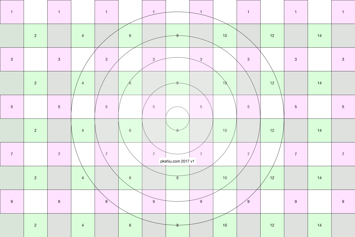
Test grid image for experimenting with responsive banner image layout
Template Examples
See how the York and Bedford templates crop this image on laptop (1280x800) or iPhone (640 x 960):