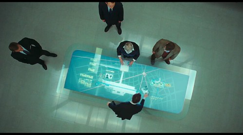


Do you put screenshots in your powerpoints or keynote presentations? Please stop now. Unless your presentation is actually about screen design, there is no real reason to include a screenshot of a software product or a website.
Why do people put screenshots in presentation? It is either to show progress, or features:
- "Look at these screens ! We finished the product ( actually it barely works, that's why we cannot give a real demo)"
- "Look at the menus ! We created so many useful features (but how often are these actually used?)"
This is all wrong

This point was driven home for me today when I went to an otherwise great presentation made by a town's IT department to a citizen group. The presentation content was great, but the slides were all "bullet lists" and "screenshots". Because the audience consists of many older citizens, at one point someone raised his hands and say "I cannot read a single thing on your slide!"
Point made clear (sic)
This entire incident broke two fundemental rules about making a presentation:
- Know your audience
- Tell a story
Know your audience
In this particular example, we know that the citizen group consists of a large number of seniors. Many of them are also non technical. Yet the slides were all unreadable, full of small text bullet lists and screenshots. The materials were full of technology acronyms that the presenters did not explain, again until someone asked "what is GIS"?
Tell a Story
Instead of presenting a list of facts and show the webpages that the user can use to execute particular sets of functions, the presenter should have framed the presentation as a set of stories. Put the audience at the center of the story. How would the audience use this feature to achieve a desire goal?
An Example
As an example, part of the presentation is to highly a new GIS (Geographic Information System) enabled feature on a town website. A staff or a resident can now easily lookup information related to a particular property at once: perperty tax, voting district assignment, school district, neighborhood, distance to wetlands and recreational facilities, etc. The original data are stored in separate databases. Some of the geographic information, like wetlands and school districts, are geographic boundaries drawn on maps. So a special type of database and data processing is required to relate a property address to, say a district boundary. The technology is cool and useful. But showing a screenshot of the website with all the overlays is (1) unreadable, and (2) only exciting for perhaps a techie.
Instead, what if the presentation centers around how a resident may do to collect such information? How many "stops" does the resident need to make around the town offices to look up different information from different sources? But now all she has to do, or the town's staff has to do, is to visit the website, and obtain all the information she needed. 30 seconds instead of spending the morning at town hall.
The slides can be a set of pictures showing the rooms or counters at the town hall, or the piles of paper records and maps that she would have to look through, and the success case can be a slide of a happy user at her computer.
So please, stop putting screenshots in your presentation.